Integrating the Cloud Management Icon Set into Modern Digital Workflows
In the fast-paced environment of digital product development, visual consistency is not merely an aesthetic preference; it is a functional necessity. Whether you are designing a complex SaaS dashboard, building a mobile application for enterprise resource planning, or creating educational materials about distributed computing, the clarity of your interface dictates user success. This is where a specialized Cloud Management Icon Set becomes an indispensable asset. Rather than treating icons as afterthoughts to be scavenged from disparate sources, integrating a cohesive icon library early in the design process streamlines production and enhances the final user experience.
A comprehensive cloud management icon set typically includes symbols representing servers, databases, security protocols, networking nodes, and data flow mechanisms. When these elements are designed with a unified visual language, they reduce cognitive load for the user. For professionals ranging from UI/UX designers to freelance developers, understanding how to leverage these assets effectively can significantly impact project timelines and quality.
The Strategic Value of Unified Visual Assets
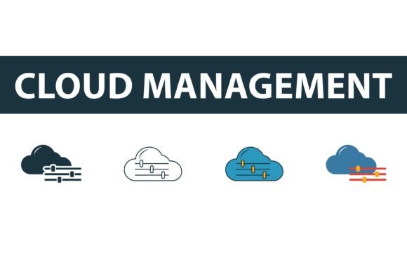
The primary advantage of using a dedicated Cloud Management icon set lies in consistency. In web development and app design, inconsistency creates friction. If one server icon is thick and rounded while another database symbol is thin and sharp, the interface feels disjointed. This subtle visual noise can undermine user trust in the platform’s reliability. By utilizing a pre-packaged collection that offers four distinct styles—filled, outline, colored, and flat—you ensure that every visual element speaks the same design language.
Furthermore, these icons serve as universal shorthand. In cloud computing contexts, concepts like "auto-scaling," "load balancing," or "encryption" are abstract. A well-designed symbol translates these complex technical processes into instantly recognizable visual cues. This is particularly crucial for dashboards where space is limited and information density is high. A clear icon allows users to scan and interpret system status rapidly, facilitating quicker decision-making.
Understanding the Four Core Styles
Versatility is key when selecting assets for long-term projects. A robust icon collection provides multiple variations to suit different interface states and design requirements. Here is how the four standard styles found in a professional cloud management set interact with various design phases:
- Outline Icons: These are ideal for inactive states or secondary navigation items. Their lightweight appearance ensures they do not dominate the visual hierarchy, allowing text labels to remain the focal point. They are particularly effective in minimalist designs where whitespace is prioritized.
- Filled Icons: Use these for active states, selected tabs, or primary actions. The solid weight draws the eye immediately, signaling importance or current selection. In a cloud management console, a filled server icon might indicate a running instance, while an outline version indicates a stopped one.
- Colored Icons: Color adds an emotional and functional layer to data visualization. Colored symbols are excellent for alerts, status indicators, or highlighting critical infrastructure components. For example, a red-colored shield icon can instantly communicate a security breach, while a green checkmark confirms successful deployment.
- Flat Symbols: These offer a middle ground, providing solid shapes without the heaviness of fully filled icons or the complexity of gradients. They work well in illustrative contexts, such as onboarding screens, marketing landing pages, or documentation headers where a friendly, approachable aesthetic is desired.
Integration into the Development Workflow
Implementing a Cloud Management Icon Set effectively requires planning before a single pixel is pushed to production. The process begins during the wireframing and prototyping phase. Instead of using placeholder boxes, designers should insert relevant icons from the set to test spatial relationships and layout balance. This early integration helps identify potential clutter issues and ensures that the iconography supports the information architecture rather than obstructing it.
During the development phase, the file formats provided in professional collections play a critical role. You will typically receive EPS, AI, SVG, and JPG files. Each format serves a specific purpose in the pipeline:
- SVG (Scalable Vector Graphics): This is the gold standard for web and app development. SVGs are code-based, meaning they can be styled directly with CSS. Developers can change colors, sizes, and strokes dynamically based on user interactions or theme settings (such as dark mode) without needing to request new assets from designers. This drastically reduces back-and-forth communication and speeds up iteration.
- AI and EPS Files: These vector formats are essential for the design team. Using Adobe Illustrator or similar software, designers can modify the base shapes if a custom variation is needed. Because these are vector graphics, they can be scaled to any size without loss of quality, ensuring crisp rendering on high-resolution Retina displays and 4K monitors.
- JPG Files: While less flexible for interactive interfaces, JPGs are useful for static presentations, email newsletters, or social media graphics where vector support is limited. They provide a quick way to share visual concepts with stakeholders who may not have design software installed.
Practical Tips for Efficiency and Quality Control
To maximize the utility of your icon set, consider adopting a systematic approach to organization and implementation. One common pitfall is inconsistent sizing. Even within a single set, optical alignment can vary. It is best practice to wrap each icon in a standardized container or viewbox within your code. This ensures that regardless of the icon’s internal geometry, it occupies the same amount of space in the layout, maintaining grid integrity.
Another crucial aspect is accessibility. Icons should never convey meaning solely through shape or color. Always pair icons with descriptive text labels or ARIA (Accessible Rich Internet Applications) attributes. For instance, a trash can icon for deletion should have an accompanying label or screen-reader text stating "Delete Item." This ensures that users relying on assistive technologies can navigate your cloud management interface effectively.
When editing icons, maintain the stroke width and corner radius consistency. If you customize an outline icon to be thicker, apply the same adjustment to all other outline icons in the set. Most professional collections are built on a grid system, making it easier to maintain these proportions. Deviating from the established style guide can break the visual harmony and require significant rework later.
Long-Term Usability and Scalability
As your project grows, so too will your need for additional visual assets. Choosing a Cloud Management icon set that is part of a larger web development icons collection offers a strategic advantage. It ensures that as you add new features—perhaps moving from basic storage management to advanced AI analytics—you can extend your visual language without introducing conflicting styles. This scalability is vital for products with long lifecycles.
Moreover, consider the maintenance aspect. Vector files are easy to update. If your brand undergoes a refresh, you can globally adjust the color palette of your SVG icons via CSS variables or update the source AI files and re-export. This flexibility future-proofs your design investment, allowing you to adapt to new trends or branding guidelines without replacing the entire asset library.
Conclusion
The integration of a high-quality Cloud Management Icon Set is more than a decorative choice; it is a structural component of effective digital communication. By understanding the distinct roles of filled, outline, colored, and flat styles, and by leveraging the technical benefits of SVG and vector formats, teams can create interfaces that are both beautiful and functional. Whether you are a freelancer polishing a portfolio piece or an enterprise team building a complex cloud infrastructure dashboard, prioritizing consistent, well-organized iconography will enhance usability, streamline development, and elevate the overall quality of your product. Start by auditing your current assets, selecting a versatile collection, and establishing clear guidelines for their use across your workflow.