Mastering the Content Management Icon Set
In the fast-paced world of digital design, clarity is king. Whether you are building a complex dashboard for a SaaS platform or polishing the user interface of a mobile app, visual cues play a pivotal role in how users navigate and understand your product. This is where a high-quality Content Management Icon Set becomes an indispensable asset. It is not merely about decoration; it is about communication. A well-crafted icon can replace paragraphs of text, guiding users intuitively through editing, publishing, and organizing tasks without them having to stop and think.
Why Visual Consistency Matters in CMS Design
Content management systems (CMS) are often dense with functionality. From draft saving to media library organization, the sheer volume of actions available can overwhelm even experienced users. Integrating a cohesive Content Management icon set helps reduce cognitive load. When icons share a consistent visual language—whether through line weight, corner radius, or color palette—they create a sense of order. This consistency builds trust. Users subconsciously recognize that if one icon looks professional and polished, the underlying system likely is too.
For designers and developers, starting from scratch is rarely efficient. Crafting unique symbols for every possible action, such as "upload," "delete," "edit," or "archive," consumes valuable time that could be spent on core functionality or user experience testing. By leveraging a pre-made collection, you ensure that every symbol aligns perfectly with the others, maintaining pixel-perfect harmony across your interface.
Exploring the Four Distinct Styles
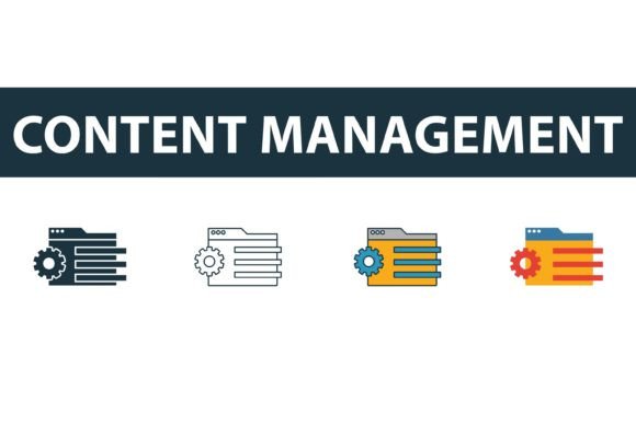
One of the standout features of this particular web development icons collection is its versatility. It does not force you into a single aesthetic. Instead, it offers four distinct styles, allowing you to match the icons to your brand’s personality and the specific context of your application.
- Filled Symbols: These are bold and assertive. Filled icons are excellent for primary actions or active states in a navigation bar. They carry more visual weight, making them ideal for drawing attention to critical functions like "Publish" or "Save."
- Outline Icons: Clean and minimal, outline styles are perfect for secondary actions or interfaces that require a lighter, airier feel. They work beautifully in data-heavy dashboards where you want to avoid visual clutter while still providing clear signposts.
- Colored Variants: Sometimes, monochrome isn't enough. Colored icons add a layer of immediate recognition. For instance, a red trash can for delete or a green checkmark for success communicates status instantly, leveraging universal color psychology to enhance usability.
- Flat Symbols: Stripping away depth and shadow, flat icons offer a modern, straightforward look. They are highly legible at small sizes and fit seamlessly into contemporary, minimalist web designs that prioritize speed and simplicity.
Having access to all four styles within a single Content Management Icon Set means you can mix and match based on hierarchy. You might use outline icons for inactive tabs and filled versions for the active tab, creating a dynamic interactive experience without needing to source assets from different libraries.
Technical Flexibility for Modern Workflows
Designers and developers know that file format compatibility can make or break a workflow. This collection addresses that need by providing files in EPS, JPG, AI, and SVG formats. Each format serves a specific purpose in the production pipeline.
The SVG file is arguably the most crucial for modern web development. Scalable Vector Graphics ensure that your icons look crisp on any screen resolution, from standard desktop monitors to high-density Retina displays. Because they are code-based, SVGs are lightweight, improving page load speeds—a key factor in SEO and user retention. Furthermore, SVGs can be styled directly with CSS, allowing you to change colors or add hover effects without touching the original asset.
For those working in Adobe Illustrator or other vector-based design tools, the AI and EPS files are invaluable. These allow for deep customization. If your brand guidelines require a specific stroke width or a unique geometric tweak, you can edit the anchor points directly. This level of control ensures that the icons don’t just look good; they look like they were made specifically for your brand.
While less common for interface design, the inclusion of JPG files provides a quick-reference option for presentations, mood boards, or documentation where vector editing is not required. It demonstrates a thoughtful approach to catering to various stakeholders in a project, from marketers who need quick visuals to developers who need clean code.
Practical Applications Across Industries
The utility of a comprehensive Content Management icon set extends far beyond traditional software development. Consider the diverse environments where these symbols add value:
- Corporate Intranets: Large organizations often use internal portals for document sharing and HR management. Clear icons help employees navigate complex internal systems with ease, reducing support tickets and training time.
- Educational Platforms: Learning Management Systems (LMS) rely heavily on content organization. Icons for folders, quizzes, videos, and downloads help students and educators find resources quickly, enhancing the learning experience.
- E-commerce Backends: Store managers need to process orders, update inventory, and manage customer data. A intuitive icon set streamlines these daily tasks, boosting productivity and reducing errors in high-pressure environments.
- Creative Portfolios: Freelancers and agencies showcasing their work can use these icons to categorize projects or indicate file types, adding a layer of professionalism to their personal branding.
In each of these scenarios, the goal is the same: to facilitate smooth interaction. When users can predict what an icon does based on its shape and style, friction disappears. This leads to higher engagement rates and greater satisfaction with the product.
Making the Right Choice for Your Project
When evaluating a Content Management Icon Set, consider the scale of your project. If you are building a large-scale application, ensure the set covers niche actions you might need later, such as "version history" or "collaborator invite." Consistency is harder to maintain if you have to supplement a basic set with disparate icons from other sources.
Also, think about accessibility. While this set offers beautiful colored and filled options, always ensure that your implementation maintains sufficient contrast ratios for users with visual impairments. Outline icons, in particular, should have adequate stroke width to remain visible against various background colors.
Ultimately, investing in a versatile, high-quality icon library is an investment in your product’s usability. It bridges the gap between functional code and human-centric design. By choosing a set that offers multiple styles and robust file formats, you future-proof your design system, ensuring it remains relevant and effective as your project grows. Whether you are a solo entrepreneur launching a blog or a team building the next enterprise solution, the right icons can elevate your interface from functional to exceptional.